Kuda’s design team was growing quickly to meet all its design needs for the expansion project. What started as a team of 5 designers was becoming a team of 10-15 designers.
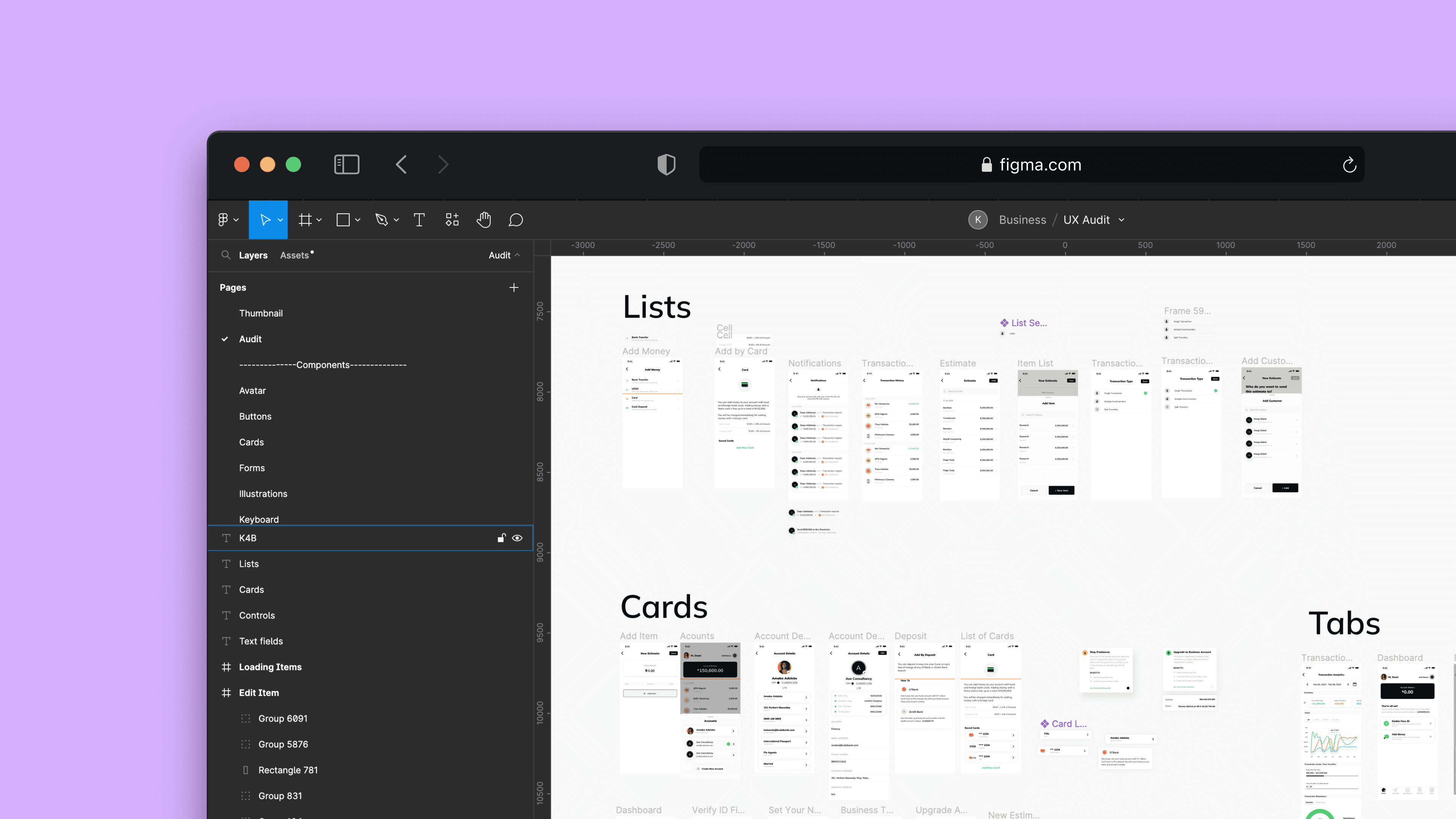
All the design assets were stored on each design file, on a page named "Design System". The objective was simple, to create each UI element into reusable and discoverable components.
CHALLENGES
Consolidating all the existing visual styles and elements into one design system was not an issue, the major issues were:
Kuda was expanding, so a new app was being built with different design styles.
I had to account for both styles of components.
Kuda was also going to launch a business app.
Mobile and web had different component styles.
GOALS
Create a design system (in Figma) considering the team.
Reduce the time it takes to find a component
Reduce the dependency on the team lead when new teammates joined
Onboard new team members faster, since it’s a fast-paced environment.
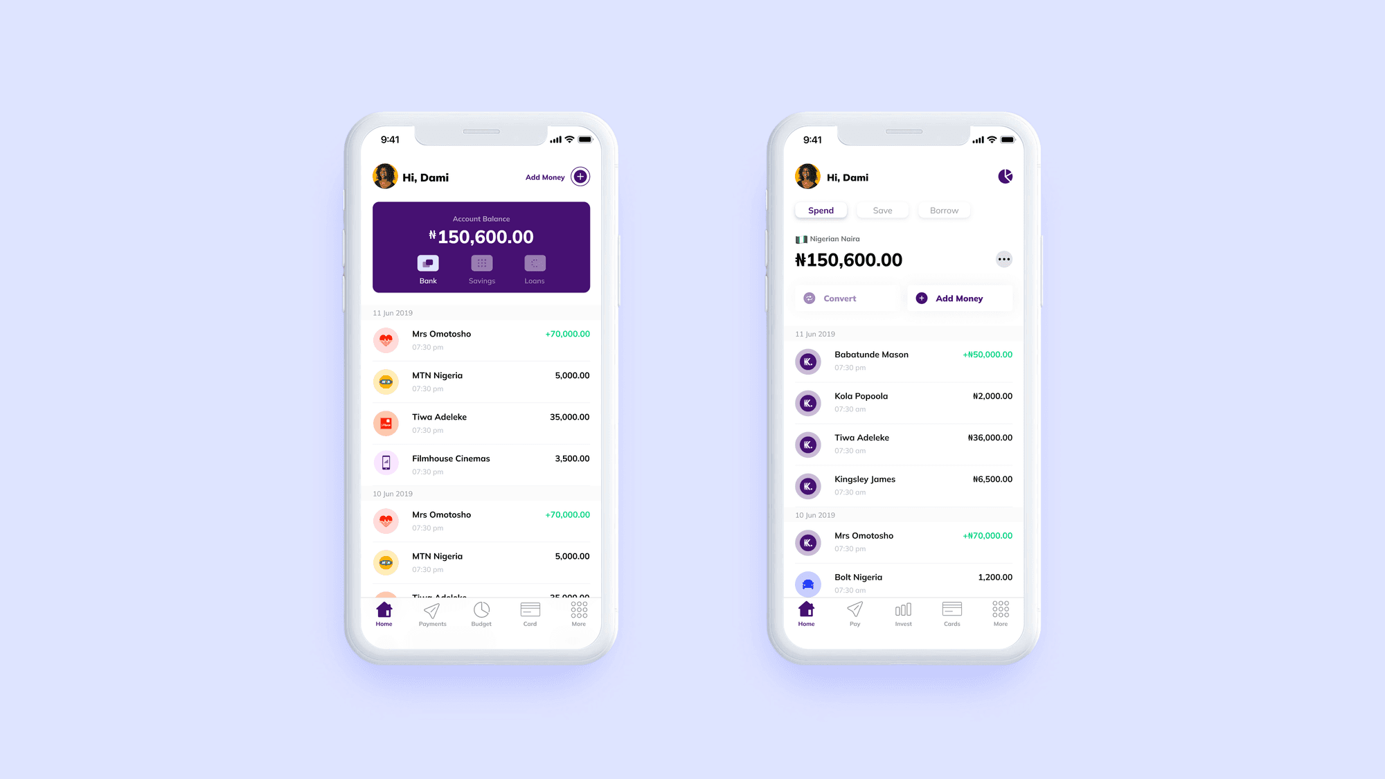
Kuda Design System 0.1
I tackled each product one at a time, I started with the Legacy app since it had the most foundational UI elements and styles and scaled it to the Kuda other products.
UX Research
Most of my research was on handling cross-platform & multi-brand design systems. I found out how to structure/organize files for the design system. I evenly settled on the separate-files approach——here the foundations (styles) and the component library were two separate files published in the workspace.
Design Audit
Next, I searched the app for UI elements that were used repeatedly and added them to an existing list of predefined components to be created. At the time, there were about 5 live features put into different Figma pages.
STRUCTURE
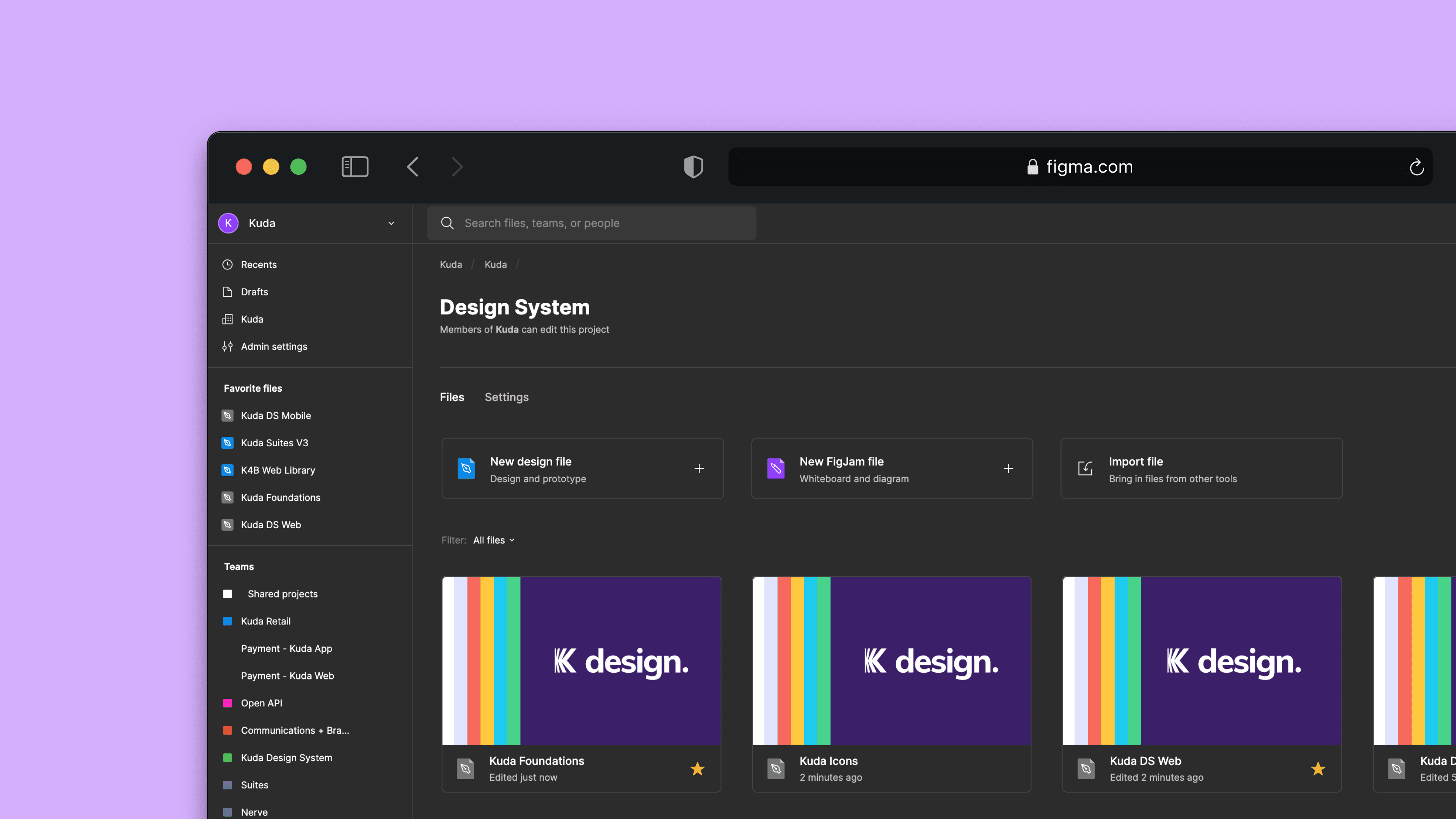
The “Foundation” file contained mostly styles, text styles, colours, shadows and Icons. These styles were published to the workspace, in this case, the design system.
After testing this approach, it was best to have the icons and text styles in their own respective files.
Eventually, we settled on 4 file design system structure consisting of Foundations, Text Styles, Icons and Component Libraries.
Component LiBRary
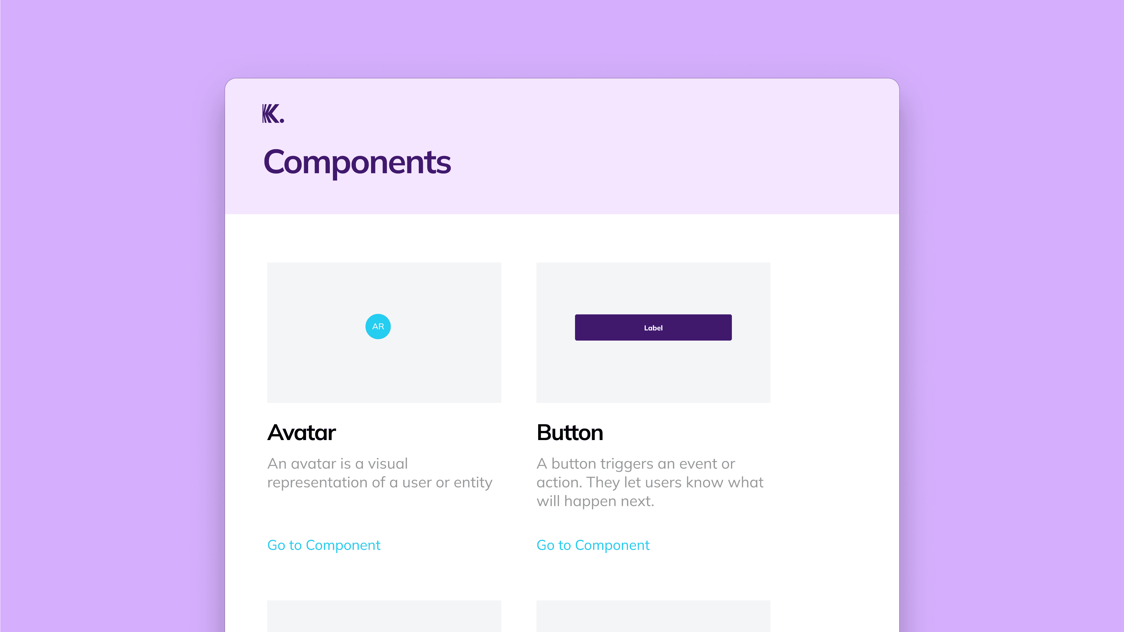
We created separate components for mobile and web because of their differences. Hence, we maintained two libraries for the components and a single shared library for Android and iOS (Mobile)

THEMING
Other than the regular themes (light and dark), we introduced a new theme for Kuda Business. Kuda Business, simply put is a different bank account type for business owners. The product’s core was the same as the retail app. Besides the obvious business features difference, the major difference was the branding (logo and colour).
Documentation
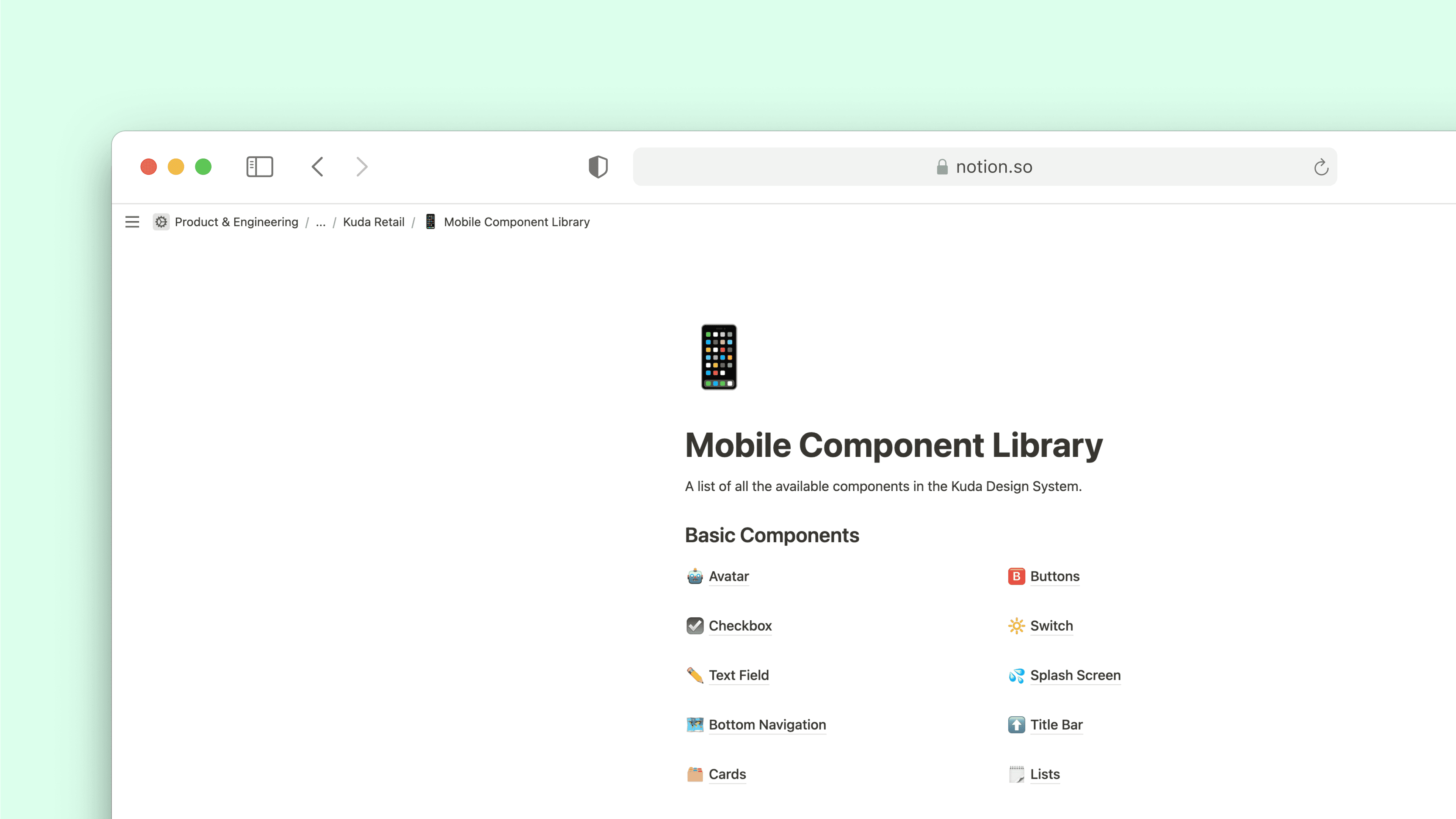
Initially, documentation was done on Notion and we linked the documentation of each component on Figma. Documentation was slow but we knew it was important if we were going to get mass adoption by our teammates (including the engineers).
We also created some Documentation in Figma and started some short video demos for Components.
INTERNAL COMMS
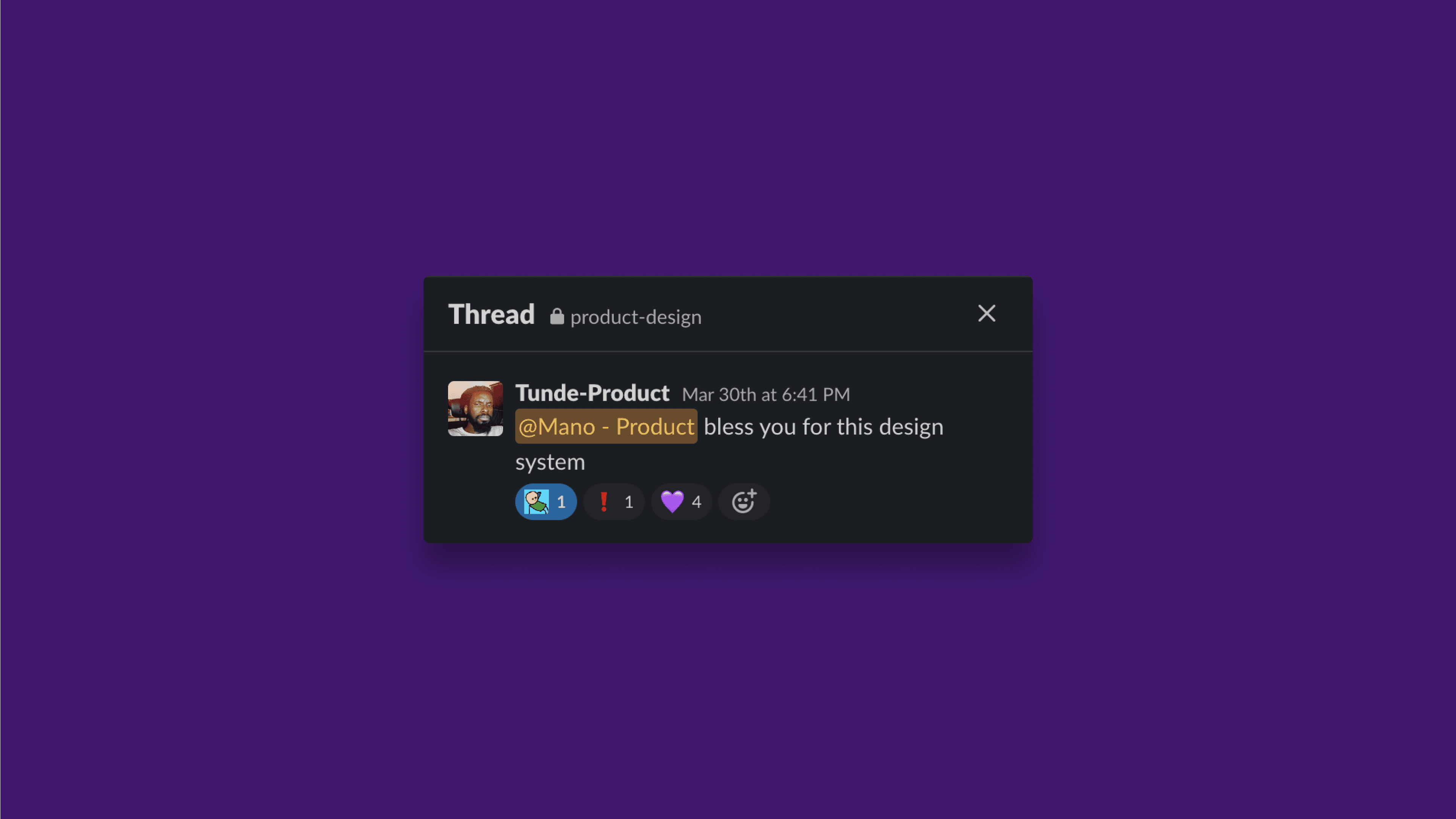
We currently push updates to `k-designsystem` on slack, and have short meetings when we make important changes or migrations.
Future plans include:
- Launching a newsletter for design system updates
- Hosting a Kuda design system website with documentation and a sandbox for people to try out the components
IMPACT
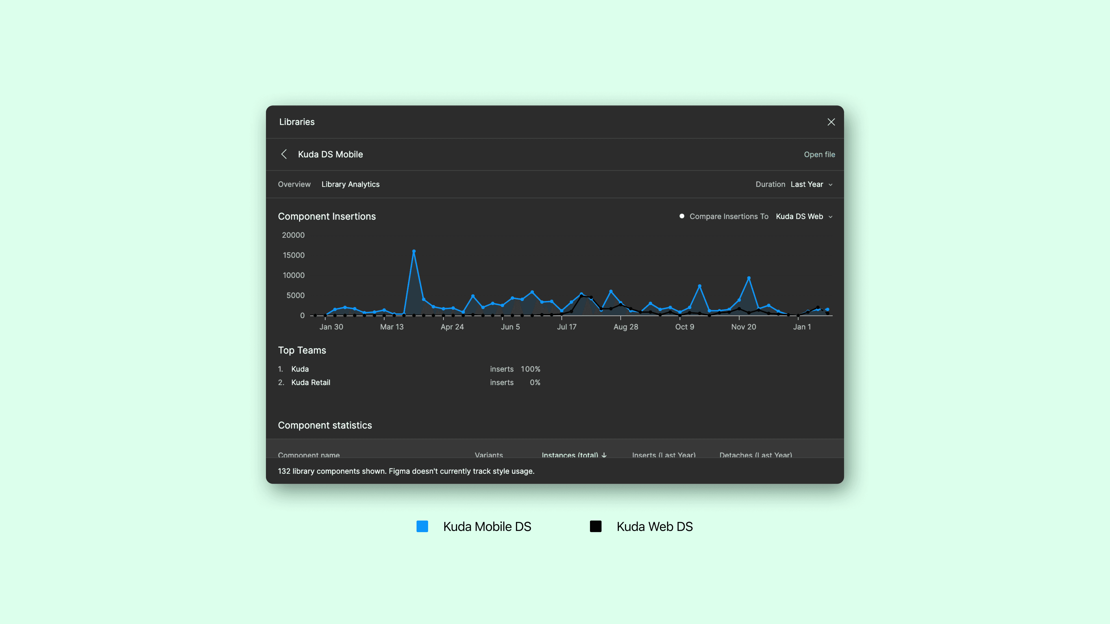
Kuda’s Design System is currently being used by 13 designers and maintained by 2 designers.
- 3 Component Libraries (Web, Mobile and Icons)
- 100+ components
- Used in 3+ Kuda Products
TAKEAWAY
- Converted static/page-by-page DS to a fully searchable component library
- File structure - Foundation, Component Libraries, Text Styles, and Icon Library
- Cleaned-up existing text style
- Started multi-platform DS
BACK